|
|

![]()
|
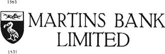
MARTINS
BANK’S COAT OF ARMS |
![]()
|
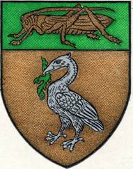
Grand Designs…
“Or, a Liver Bird (or Cormorant) Sable,
holding in the beak a branch of Laver (or Seaweed) Vert, on a Chief
of the third a Grasshopper of the first”. The
Coat of Arms is printed in its correct colours {on the cover of this
booklet}. (ABOVE,
LEFT)
On the Bank's stationery it is printed
in black and white, {the various dots and lines representing the colours, so
that it is possible to "read" the colours by having knowledge of
the printer's black and white interpretation which is, of course, standard.
There is, therefore, a great deal of history
behind Martins iconic coat of arms, and of all the many mergers in Martins’
400 year history, it is the union of the grasshopper and the liver bird that
is deemed most important, and gives is Martins’ magnificent Head Office
building at No 4 Water street Liverpool. Martins is the only national bank to
dare to conduct its business outside London.
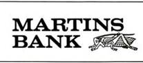
The coat of arms is a feature of cheques and some other stationery
items and publications until the end of Martins in 1969: x
… well, almost…
|
|||||||||||||||||||||||||||||
|
Bye bye Birdie… |
(…or Liverpool is airbrushed out) |
||||||||||||||||||||||||||||
|
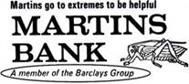
It’s all
a bit strange really, the tale of Martins Bank begins with the sign of the grasshopper, and ends with it too – joined in between by the liver bird, together they are a strong symbol of the
Bank from 1928 onwards: - its rapid expansion, and its mission to go to
extremes to be helpful. It is however,
almost as if the Liver Bird is off guard when the spread eagle of Barclays
swoops down and suddenly only the grasshopper remains. And maybe she was asleep, as
Martins’ corporate image appears to drop her completely around the time of
the merger talks…
The
Emblems that came and went: The Grasshopper and the Liver Bird in various
incarnations, before making way for the Spread Eagle of Barclays:
The (Spread) Eagle
has landed…
Is it
perhaps an embarrassment to suitors that despite being based outside London, Martins
has been such a successful bank? Is a
successful image of Liverpool perhaps too much? As we have seen, the very word “Liverpool”
is a bone of contention at the time of the merger with the Lancashire and
Yorkshire Bank. The Liver Bird does
however have one major advantage over all future brandings – Barclays
included – as she is seen more often than not carved into the stonework on
many former branches up and down the land, whether or not they are nowadays
still run as banks, or fulfil new roles as wine bars, betting shops and beauty salons. Now that’s a REAL legacy…
m |
|||||||||||||||||||||||||||||