|
|

![]()
|
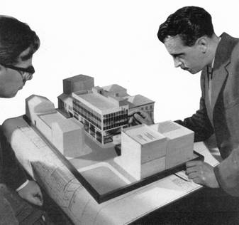
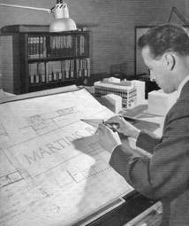
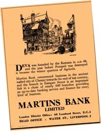
DESIGNING MARTINS BANK |
![]()
|
|
||||||||||||||||||||||||||||||||||||||||||||||||||||||||||||||||||||||||||||||||||||||||||||||||||||||||||||||||||||||||||||||||||||||||||||||


|
|
|
|
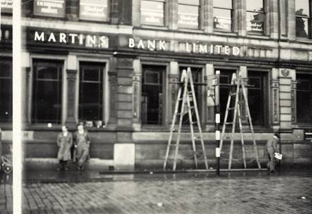
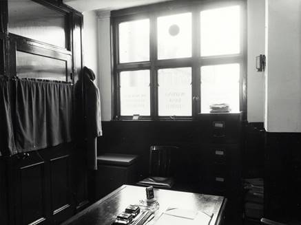
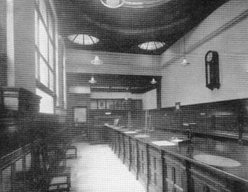
Dark and forbidding -
the interior of the original building. Images © Martins Bank Archive
Collections |
|
There have been cases where work on adjacent sites has had
adverse effects on the Bank’s own work, such as basement flooding. While
weather can often interfere with the work, the progress of a contract is
always to some extent controlled by the ability of specialists to meet the
agreed delivery dates. Some items require a considerable time from order to
delivery in site, and when one remembers that very often the necessary
dimensions are not available until the main structure is in position, it is
easy to see that sometimes delays are very difficult to prevent.
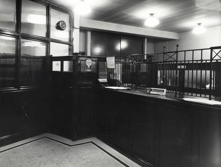
![]()
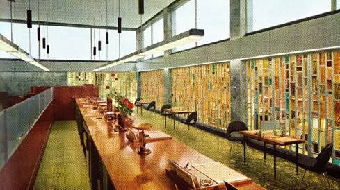
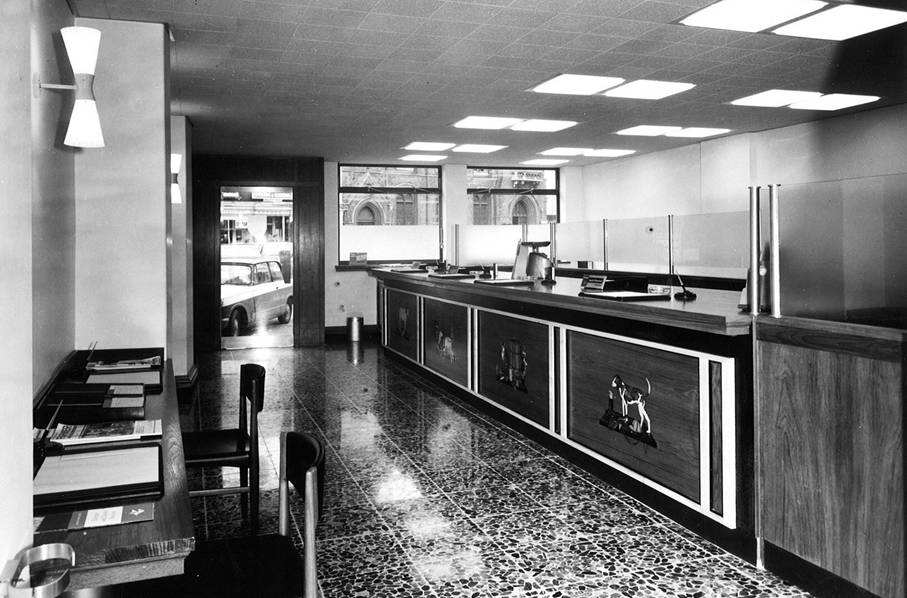
Bright and welcoming, the interior of the new
branch
Image - Martins Bank
Archive Collections
![]()
The story is not yet complete, for there will inevitably be
teething troubles – a door or a drawer which will not close properly; a
heating system which suddenly develops a jinx and tries to roast everybody,
but these matters can be rectified quickly. Customers give their own critical
analysis, usually of the design, and the staff, thankful to be free from dust
and grit, add their opinions – a wall paper is changed. but that is another
story.
![]()
|
|
|
|
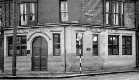
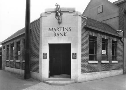
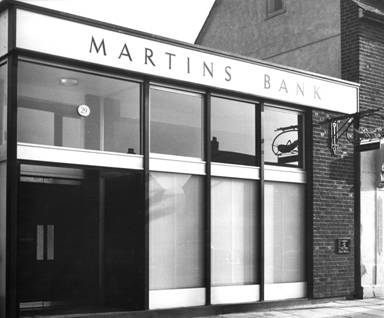
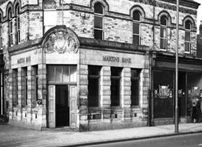
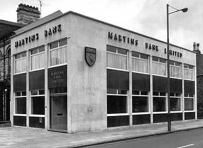
Tyne Dock – Before and After, Images – ©
Martins Bank Archive Collections |
|
A
sympathetic replacement?

![]()
 For the staff in particular,
a complete change from an elderly branch building to something new and state
of the art, with much better working conditions is as good as a feast. Martins prides itself on the use of new
innovations, such as central heating through ceiling coils, and special light
fittings that minimise and soften the glare of the modern flouescent bulbs.
The new branches have better staff rest room facilities, many with kitchen
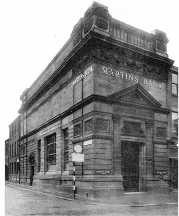
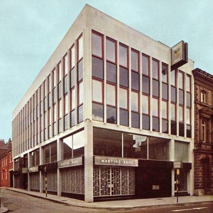
facilities. Between 1963 and 1965, a complete transformation takes place in
Preston, where the former Head Office of the Preston Union Bank is tired,
cramped, dark and miserable. Despite
oozing traditional feelings of security and permanence, the building belongs
to another age, and the two year programme of works that follows sees a large
number of staff relocated to temporary premises, whilst their new and
gleaming statement of sixties hope and glory takes place. Having worked at the “new” Fishergate branch,
our editor is broadly a fan – compared to some of the horror stories you will
encounter on our special feature page, Preston has an elegance of its own,
and a practicality that has kept it in use as a bank for the best part of
fifty years (although the huge reductions in manpower since the 1960s will
have left many an empty floor. Here is
the transformation at Preston, followed by a short extract from Martins Bank
Magazine’s visit to the new Branch in 1965, which provides us with some
architectural details…
For the staff in particular,
a complete change from an elderly branch building to something new and state
of the art, with much better working conditions is as good as a feast. Martins prides itself on the use of new
innovations, such as central heating through ceiling coils, and special light
fittings that minimise and soften the glare of the modern flouescent bulbs.
The new branches have better staff rest room facilities, many with kitchen
facilities. Between 1963 and 1965, a complete transformation takes place in
Preston, where the former Head Office of the Preston Union Bank is tired,
cramped, dark and miserable. Despite
oozing traditional feelings of security and permanence, the building belongs
to another age, and the two year programme of works that follows sees a large
number of staff relocated to temporary premises, whilst their new and
gleaming statement of sixties hope and glory takes place. Having worked at the “new” Fishergate branch,
our editor is broadly a fan – compared to some of the horror stories you will
encounter on our special feature page, Preston has an elegance of its own,
and a practicality that has kept it in use as a bank for the best part of
fifty years (although the huge reductions in manpower since the 1960s will
have left many an empty floor. Here is
the transformation at Preston, followed by a short extract from Martins Bank
Magazine’s visit to the new Branch in 1965, which provides us with some
architectural details…
![]()
|
|
|
|
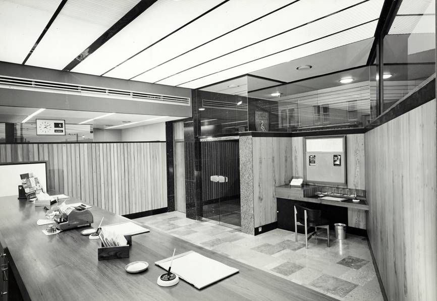
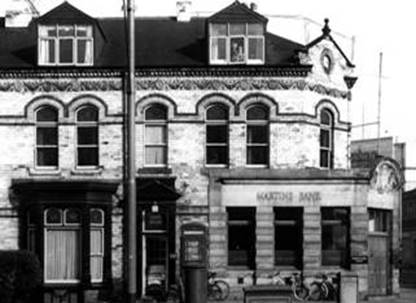
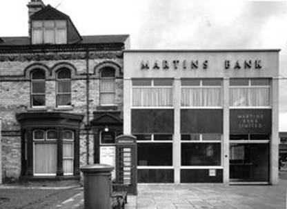
With a nod to the past – the two branches occupy
broadly the same amount of space… Images – Martins Bank Archive
(Left) and © Barclays (Right) |
|
 “The
entrance porch is of clear glass but the windows are of hand-made tinted
glass set in aluminium frames, the counter is of teak, faced with Sicilian marble, and
the walls of the main banking office are of wide elm boarding with one large
panel of silver-grey marble. The management rooms are lined with cedar of
Lebanon against a maple background and hot water coils in the ceilings warm
all the office areas. The staff kitchen has built-in teak wall cupboards with magnetised catches”…
“The
entrance porch is of clear glass but the windows are of hand-made tinted
glass set in aluminium frames, the counter is of teak, faced with Sicilian marble, and
the walls of the main banking office are of wide elm boarding with one large
panel of silver-grey marble. The management rooms are lined with cedar of
Lebanon against a maple background and hot water coils in the ceilings warm
all the office areas. The staff kitchen has built-in teak wall cupboards with magnetised catches”…
![]()
|
|
|
|
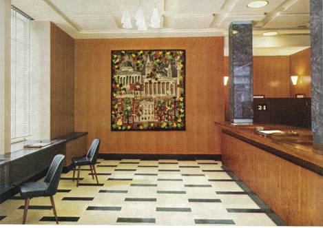
On the inside – from seriously drab to a warm Kodachrome® glow! Images © Martins Bank Archive Collections |
|
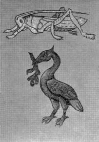
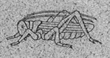
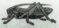
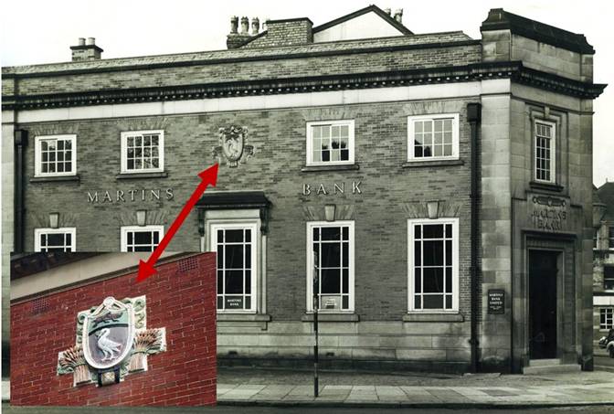
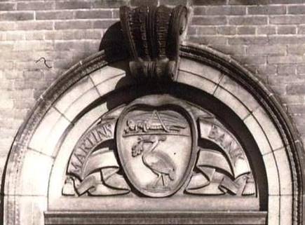
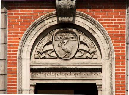
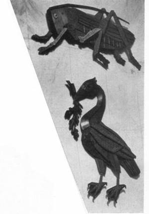
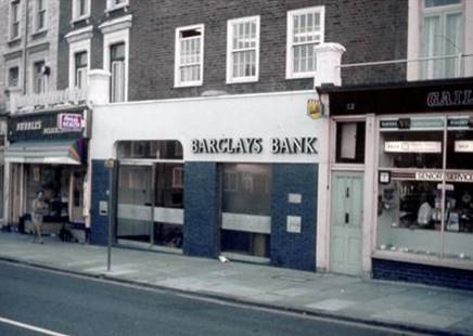
Until 1964, Martins Branches
displayed a number of different representations of the Bank’s name and/or
Coat of Arms on the outside walls of their buildings. From the mid 1950s onwards, a new metal
version of the Grasshopper and the Liver Bird has begun to be seen, but 1964
sees the move into fibreglass, the lightest substance yet used for
this type of signage. Curious to know
just how the mass-production of Bank signs is achieved, Martins Bank Magazine
lifts the lid on the process in its Summer 1964 issue…
Fibreglass – the way
forward…
![]()
|
|
|
![]()
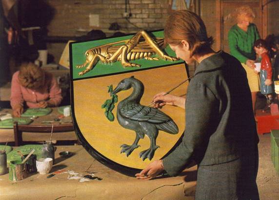
 since the last war, through research and experiment, the uses of fibreglass
have developed to such an extent that there are now companies engaged solely
in the manufacture of fibreglass products. Such a company is Carleton Russell Limited whose
works at Loughborough we visited recently. The company makes fibreglass
signs and displays and has produced several of our Bank signs. At the time of
our visit the finishing touches were being made to the huge sign, seen in the colour
photograph above, which now gleams upon customers entering our branch at Digbeth,
Birmingham. Why fibreglass?
Two of its advantages, lightness and flexibility, have much to recommend it
as the material for a wall sign, either inside or outside a building. The
Coats of Arms carved in stone which once surmounted the two entrances to our
Leeds office have now given way to
fibre-glass reproductions.
Weather resistance is another valuable property of these signs and Hove
branch, for example, exposed to coastal weather, is saved frequent cleaning
and retouching costs by having its external sign made from fibreglass.
since the last war, through research and experiment, the uses of fibreglass
have developed to such an extent that there are now companies engaged solely
in the manufacture of fibreglass products. Such a company is Carleton Russell Limited whose
works at Loughborough we visited recently. The company makes fibreglass
signs and displays and has produced several of our Bank signs. At the time of
our visit the finishing touches were being made to the huge sign, seen in the colour
photograph above, which now gleams upon customers entering our branch at Digbeth,
Birmingham. Why fibreglass?
Two of its advantages, lightness and flexibility, have much to recommend it
as the material for a wall sign, either inside or outside a building. The
Coats of Arms carved in stone which once surmounted the two entrances to our
Leeds office have now given way to
fibre-glass reproductions.
Weather resistance is another valuable property of these signs and Hove
branch, for example, exposed to coastal weather, is saved frequent cleaning
and retouching costs by having its external sign made from fibreglass.
![]()
 As the name suggests, glass
fibre is one of the basic
materials used in producing
fibreglass. The other is a polyester
resin, a plastic substance which bonds the glass fibre
into a strong but resilient laminate. To follow the stages of producing a sign from start to
finish, our tour of the works began at the modeller's
room. Here a model is prepared from the design, which may be merely a
blown-up photograph, the modeller working with clay which is kept damp to prevent hardening. In
this way, once the mould has been made from the model, the clay can be used
again.
As the name suggests, glass
fibre is one of the basic
materials used in producing
fibreglass. The other is a polyester
resin, a plastic substance which bonds the glass fibre
into a strong but resilient laminate. To follow the stages of producing a sign from start to
finish, our tour of the works began at the modeller's
room. Here a model is prepared from the design, which may be merely a
blown-up photograph, the modeller working with clay which is kept damp to prevent hardening. In
this way, once the mould has been made from the model, the clay can be used
again.
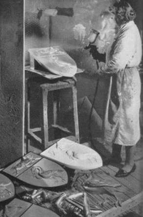
The material for the mould
is usually liquid rubber which is poured over the model but if many
reproductions are to be made from the same mould, a more robust material—plaster, wood or even fibreglass itself—is used. Once the mould has hardened it is filled
with the polyester resin to provide a 'gel coat' or smooth, outer coating.
This sets in about 30 minutes when another coat of resin is applied and the
glass fibre, in narrow, woven strips like bandages, is pressed into it.
After hardening, the reproduction is taken from the mould and examined for
flaws which can be rectified by careful application of resin.
When all imperfections have
been eliminated the reproduction is left in a curing room for between 24 and
30 hours at a temperature of 140-150 degrees Fahrenheit, this curing process
being essential for the complete binding of the glass fibre and
resin. For a hard, lasting finish the sign is then sprayed with acrylic
paints and finished by hand. We could test for ourselves the lightness and
flexibility of the finished product and we were told of its weather
resistance, but just how strong
fibreglass is we were anxious to
discover. We took a piece of smooth
fibreglass measuring about eight
inches by six inches and no more than ⅛”
thick and tried to snap it.
Our efforts succeeded only
in flexing it slightly. We then watched the same piece struck forcibly by a
golf club which produced a slight dent—on one side only! That could be put right, we were told, by
'filling-in' with fibreglass. It
is scarcely surprising that a material with such advantages—produced at highly
competitive prices too—is continually finding new markets and we left Loughborough wondering where fibreglass might be popping up next.
One thing seems certain: it will not replace steel in the strong room grill.
![]()
Not always
a shock…

![]()
 One modernisation that has stood
the test of time as being a beautiful addition to to the Liverpool skyline ,
is of course the Bank’s Head Office at 4 Water Street. Designed on classical
lines, reflecting in sumptuous detail the long association of Liverpool with
all things maritime, the building is about to make another splash here in the
twenty-first century by becoming a luxury hotel that will rival the opulence
and grandeur of many of the top hotels across the World. 4 Water Street, externally grand and
traditional is very much a statement of the future, incorporating internal
features that are way ahead of their time – a clever heating system, the best
electrical and telephone systems that the early 1930s can offer – and many of
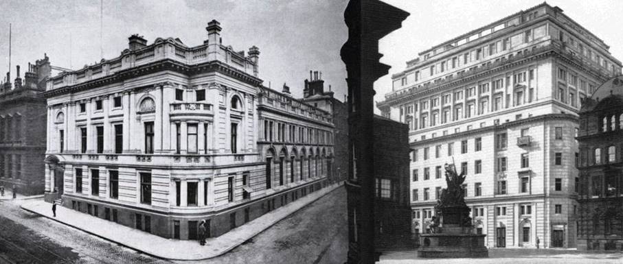
these last much longer than originally intended. Our first comparison - of No 7 Water Street
with its successor – is not a “shock
of the new” – it is simply a big step forward in terms of grandeur and
design:
One modernisation that has stood
the test of time as being a beautiful addition to to the Liverpool skyline ,
is of course the Bank’s Head Office at 4 Water Street. Designed on classical
lines, reflecting in sumptuous detail the long association of Liverpool with
all things maritime, the building is about to make another splash here in the
twenty-first century by becoming a luxury hotel that will rival the opulence
and grandeur of many of the top hotels across the World. 4 Water Street, externally grand and
traditional is very much a statement of the future, incorporating internal
features that are way ahead of their time – a clever heating system, the best
electrical and telephone systems that the early 1930s can offer – and many of
these last much longer than originally intended. Our first comparison - of No 7 Water Street
with its successor – is not a “shock
of the new” – it is simply a big step forward in terms of grandeur and
design:
![]()
|
No 7 - Compact and fewer floors |
No 4 – Rising above its rivals |
|
Image © Martins Bank Archive Collections |
|
An artistic march to the
South…
![]()


![]()
 By the mid 1930s, Martins has
begun its thirty year long push to become a truly national bank, and the
South and South-West of England become first outposts, and then
mini-strongholds, with clutches of branches in towns such as Southampton and
Bristol. A decision is taken that the Bank should very much represent the
town or city that its branches inhabit; it begins with the commissioning of
drawings and paintings to be used in advertising, and culminates by the late
1960s in individual and ever more lavish three-dimensional artworks
being made and put into branches. This
is covered in more detail elsewhere within this feature, but here is a
selection of images that show the progression of Martins’ love affair with
artworks…
By the mid 1930s, Martins has
begun its thirty year long push to become a truly national bank, and the
South and South-West of England become first outposts, and then
mini-strongholds, with clutches of branches in towns such as Southampton and
Bristol. A decision is taken that the Bank should very much represent the
town or city that its branches inhabit; it begins with the commissioning of
drawings and paintings to be used in advertising, and culminates by the late
1960s in individual and ever more lavish three-dimensional artworks
being made and put into branches. This
is covered in more detail elsewhere within this feature, but here is a
selection of images that show the progression of Martins’ love affair with
artworks…
![]()
|
|
|
|
The River Avon |
The River Thames |
|
|
|
|
|
|
|
The River Tyne |
Southampton Water |
|
Images © 1946 Graham Smith |
|
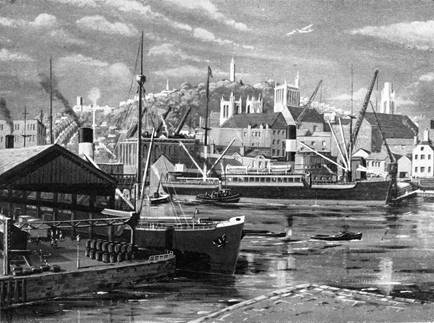
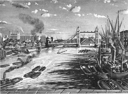
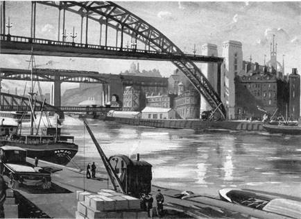
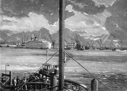
 The artist Graham Smith is
commissioned in the 1940s to paint a series of pictures to be used in
advertising under the title of “Famous Banks” – the humour of this idea is in
the name of course, as instead of looking at an image of the Bank of England
for example, you have “the banks” of the River Thames. Around the same time, Geoffrey Wedgwood is
asked to produce a drawing that will represent each of twelve english towns
and cities that had been occupied by the Romans. Advertisements carried the pictures, a
small piece about the Roman occupation of a particular town, and details of
the local Branch of Martins Bank…
The artist Graham Smith is
commissioned in the 1940s to paint a series of pictures to be used in
advertising under the title of “Famous Banks” – the humour of this idea is in
the name of course, as instead of looking at an image of the Bank of England
for example, you have “the banks” of the River Thames. Around the same time, Geoffrey Wedgwood is
asked to produce a drawing that will represent each of twelve english towns
and cities that had been occupied by the Romans. Advertisements carried the pictures, a
small piece about the Roman occupation of a particular town, and details of
the local Branch of Martins Bank…
![]()
|
|
|
|
Bath |
Leicester |
|
|
|
|
Worcester |
Chester |
|
Images © 1947 Geoffrey Wedgwood |
|
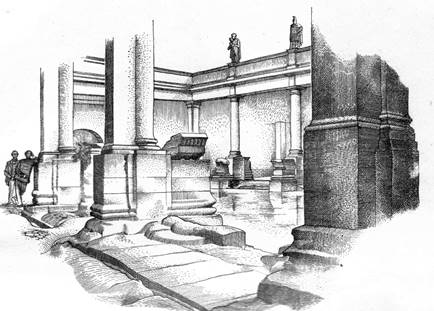
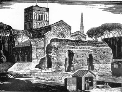
 The
Roman Towns images and advertisements are a clever way of making up for the
fact that many of the towns and cities involved do not have their own long established Branches of Martins bank – in some cases the paint is
still drying!
The
Roman Towns images and advertisements are a clever way of making up for the
fact that many of the towns and cities involved do not have their own long established Branches of Martins bank – in some cases the paint is
still drying!
As the 1960s approach, Martins starts to think
bigger. The shock of the new is
already on its way, thanks to
architects such as Ernö Goldfinger of the “Brutalism” school of design
– dystopian high rise blocks that solve the housing shortage, but remove the
soul both from an area and its inhabitants.
In the late 1950s,
Martins begins to commission works of art that can take pride of place
in new branches, and in most cases reflect something of the local area – a
kind of “giving back to the people”.
To begin with, this is neither a grand nor hollow gesture, and the
character of many a branch is decided by its own unique internal décor and
its artwork. Our next gallery combines
sixties interior design, with some one off pieces lovingly made to be proudly
exhibited within them…
![]()
|
|
|
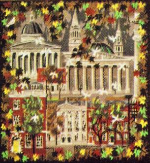
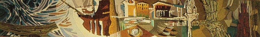
Depicting “certain landmarks in the Bloomsbury area”
this tapestry greets the Bank’s customers at London’s Tottenham Court Road
Branch. Celebrated designer, Sax Shaw
is commissioned to make this remarkable piece, and we believe that this
artwork is yet to be found somewhere in the World. The exterior of Martins’ Branch at
Tottenham Court Road is designed by Robin and Christopher Ironside, the
latter being responsible for the design of the original 10p piece used at
Decimalisation in 1971. Their design
includes Martins’ Coat of Arms in grained green granite above the door, and
for the Bank’s name to be carved into the marbled plinth above the windows:
![]()
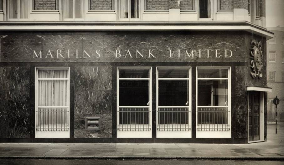
Image © Barclays Ref 30/2958
![]()
The opening of Boston Branch in
1966 sees the creation of another tapestry, this time with a design that is
not quite so straightforward as the London Landmarks depicted at Totenham
Court Road. Indeed this time, representing the journey of the Pilgrim Fathers
from Boston to America, the tapestry is illuminated at night for passers-by to enjoy – having previously only used
drawings and paintings to sell the Bank, Martins is now taking advantage of
the time a Branch is closed, in order to raise in it the interest of
the public. Further examples are shown
below, commencing with this view of the Boston tapestry:
![]()
1966 – The Journey of the Pilgrim Fathers,
Boston, Lincolnshire
![]()
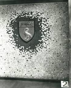
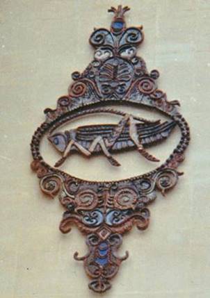
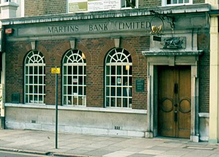
Martins’ Coat of Arms is
represented in towns across the country, and in many of them, the original
design is still to be seen, even if the owner of the building is no longer a
bank. Here are some from the vast selection,
followed by examples that you can still take a trip to visit – if you want
to…
![]()
|
|
Left – Ellesmere Port Right – Lancaster Above – Hedge End Below – Worcester St John’s
|
|
|
|
|
|||
|
|
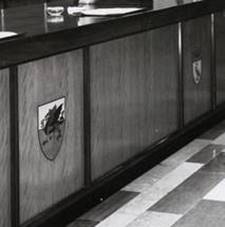
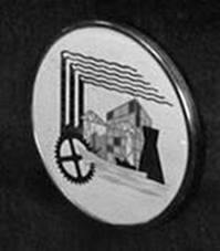
We must not forget the
decorations that were commissioned to appear along the front of Branch
counters. To the left, we have both
a Welsh dragon and Martins’ Coat of Arms at Bangor, and to the right, is
Stephenson’s Rocket which is commemorated at Stockton on Tees Branch.
Below - and like all counter
decorations, still missing – the four elaborate carvings from Newbury
Branch, depicting four local “activities”, Brewing, Chasing Farming and
Weaving… |
|
|
|
|
|||
|
|
|
||
|
|
|||
|
|
|
||
![]()
All aboard, for the “Bug
‘n’ Duck” tour…
![]()


![]()
![]()
|
Image © Barclays Ref 30/1588 |
Image © Dave Baldwin December 2013 |
Image (Inset) © 1963 Barclays Ref 30/3092 |
On the corner of Vicar Lane and
Eastgate in Leeds (left and centre), you will still find Martins’ original
welcome above the door. Meanwhile at Watford 36 High Street (right) the
carving of the Bank’s coat of arms is still clearly visible after more than
fifty years. Remarkably well preserved on the wall of the Bank’s
Branch at Heaton Chapel (below), is this elaborate working of the Coat of Arms, with an
agricultural slant…
![]()
Main Image © Barclays Ref 30/1588 and Inset ©
2000 Michael Alderson
![]()
Last but not least, this lovely
almost art deco take on the Coat of Arms above the door at the Branch at
Claughton Village, Birkenhead which, sadly, closed in July 2013.
![]()
|
Image © Barclays Ref 0030-0196 |
Image © Martins Bank Archive Collections –
Robert Montgomery |
We still have not reached the true “shock of the new”,
that this page boasts, but believe me, get there we shall, and shocking it will
be. The 1960s sees an explosion of
art and media, that brings colour into the lives of a country that is still
confined to black and white television, and limited expensive colour in
magazines. Newspapers are still
completely monochrome, save for a few words such as “Late Edition” printed in
red ink in the top corner of the front page.
Any artistic expression is embraced as new and exciting, although
within a few years we will be easily able to sort out the rubbish from the good
stuff. Before we assault your eyes with some truly shocking examples of new BUILDINGS,
here are some artworks that you will no longer be able to find on the high
street…
![]()
Pushing the boundaries…
![]()
![]()
|
|
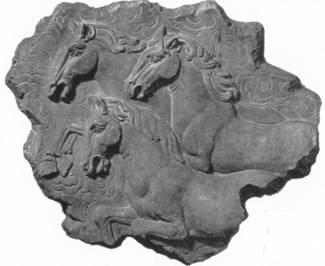
London too, has its share of
fine art: On the left Martins Bank’s Grasshopper and Liver Bird are
fashioned out of steel by Jan Kepinsky at the new branch at 84 Piccadilly
in 1964. Above, the horses represent
the T’ang Dynasty – something we are not sure quite conveys the fact that
you are inside the Branch at 25 Soho Square. Below (left), Westminster Branch makes
the headlines as “one of the most modern banks in Britain” in 1954, and
below (right) Ernö Goldfinger designs a VERY unusal window at Wigmore Street in 1968…
|
|
|
|
|
|
|
Meanwhile, in Martins Bank’s newest and fastest
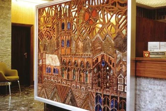
growing district – South Western – a young ceramic artist is, to great
effect, given free reign over three branches… We have
already seen good examples of the Bank commissioning pieces of art work that
reflect the local area. Three such
works are created by Philippa Threlfall for the branches at Bristol Clifton, Cheltenham
High Street, and Gloucester. Philippa’s appeal for
information about the fate of her ceramic masterpieces is already featured on
our MOST
WANTED page, but we wanted to do justice to her work on
this page with large images.
![]()
![]()
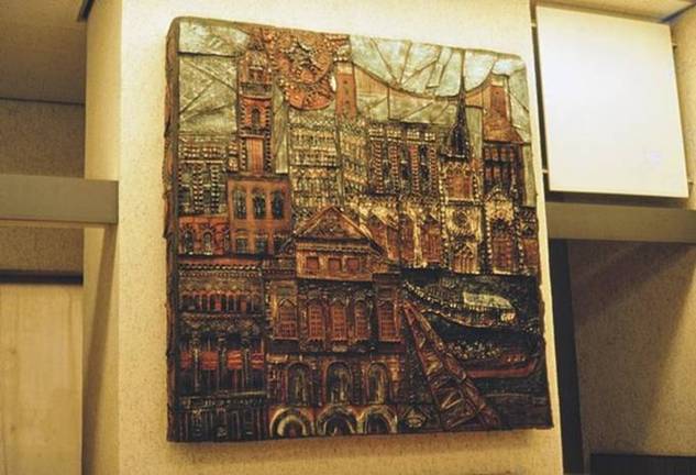
BRISTOL CLIFTON, WHITELADIES ROAD
The design depicts various buildings
and landmarks in
Bristol
![]()
|
CHELTENHAM, HIGH STREET This unusual take on the Martins
grasshopper logo arrives just before the merger with
Barclays |
GLOUCESTER, 8-10 SOUTHGATE STREET Gloucester Cathedral, viewable from both sides:
shatter-proof glass prevented hands from penetrating the fretted ceramic.
Images
© Philippa
Threlfall 1966 to date www.philippathrelfall.com |
![]()
![]()
|
|
|
|
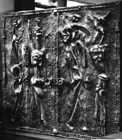
BOURNEMOUTH SCULPTOR PAUL FLETCHER’S CREATION “EXUDES
LOCALITY AND SECURITY” AT THE DOORS OF THE BRANCH. |
MARYLEBONE ROAD LONDON ANOTHER IMPRESSION OF STRENGTH AND SECURITY IS GIVEN BY THESE GATES |
The Shock of the New…

![]()
At last – our roll call of the
hideous is about to begin. These are
Branches of Martins that are either built as new, or to replace an older
office of the bank. In each case, the
best of intentions we are sure, were meant by those reponsible. It is only now that we can say – just WHAT
were they thinking?
![]()
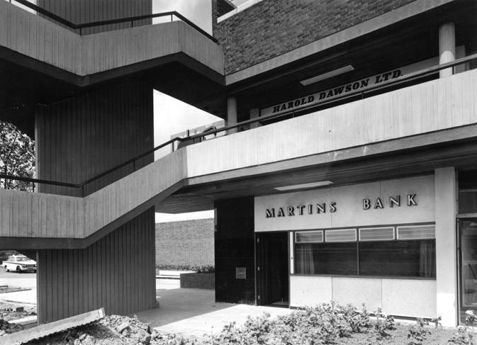
Image © Barclays Ref 33/547
![]()
Welcome to dystopia 1967 – or
Thornaby on Tees Branch, as it is known – an office drowned in its own grey
drabness, a real nightmare in concrete.
How many people were subject to trudging those awkward walkways with a
pram, we can only guess. The next
crime occurs in Bexley, Kent, just before the 1969 merger – unfortunately, we
can’t even blame Barclays, as the whole thing is planned and executed by
Martins. Marvel for yourself, at what
takes the place of Bexley’s original branch…
![]()
|
|
|
In the face of such horror, will we ever be able to
sleep easy in our beds again? Well, NO
- here is another Kentish candidate, the lovely old branch at Welling is also
destroyed and replaced.
|
|
|
|
Images
© Barclays |
|
The North of the country is not immune either. We will concede that Hartlepool York Road
had to be replaced, the original North Eastern Banking Company building is
definitely past its sell by date - but the change is positively startling –
Mum, where’s my attic bedroom gone?
![]()
![]()
|
|
|
|
Images
© Barclays |
|
|
|
|
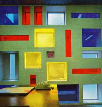
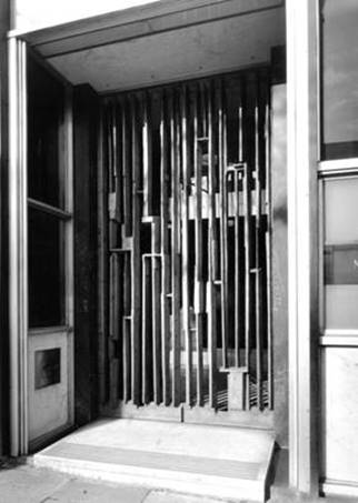
Where in the universe have we
landed? Is this one of the wobbly sets from the 1960s episodes of “Dr
Who”? Even worse - no need for L S D when paying in your £ S D
at the new Watford Branch. The uneven
cobbled effect on the floor, clashing with walls that look as if they might
close in on you at any minute, must have made for an “interesting” visit to
Watford…
![]()
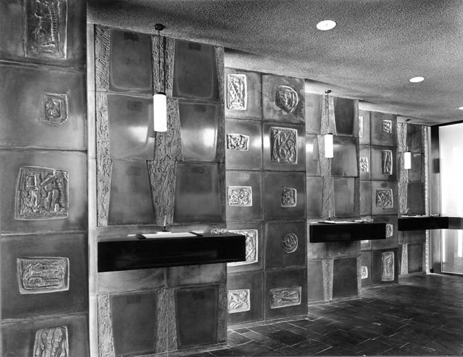
Image ©
Barclays
Things could have been a lot worse…
![]()
Our Designing Martins feature ends with a short look
at Martins’ obsession with mock tudor.
As if advertisments giving an impression that Martins Bank goes back
to Roman times aren’t enough, they do also have a habit of sticking faux
wooden beams across the front on some of the Branch buildings, to give them
that “ye olde” feel. Here are some of
the suspects:
![]()
|
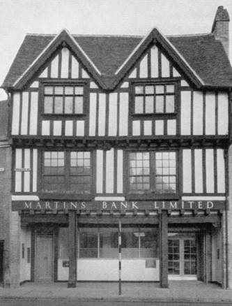
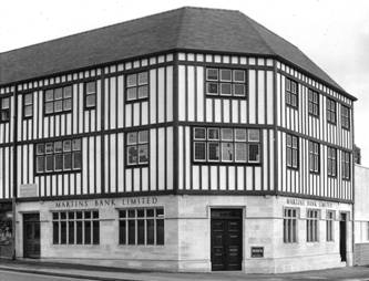
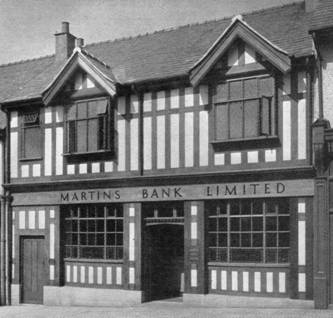
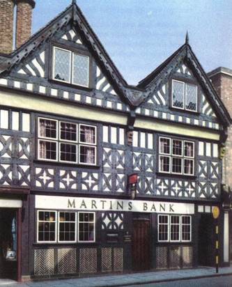
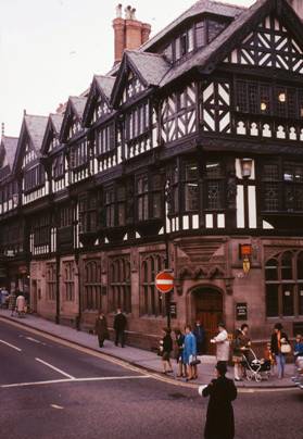
There is
of course, nothing wrong with a traditional looking Tudor or mock
Tudor building, and we would sooner have a hundred in this style, as
opposed to the some of the miserable offerings Martins ends up with by the
time of the merger. Two branches
that are both now closed, will never lose their attraction as perhaps the
finest examples of the traditional, and these are at Lymm, (below
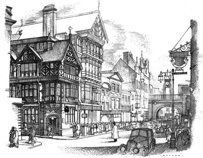
Left, and Chester, (below, right)… |
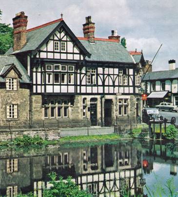
At
Stratford upon Avon (left) and Prestatyn (above,
right) there is the distinct suggestion of a conveyor belt, churning out
identically themed branches. Nantwich (below
right ) is even more fanciful, and at Swansea (below left) we even have several floors in the Tudor Style.
Image © Martins Bank Archive
Collections |
|
|
|
|
Image (Re-touched) ©
Martins Bank Archive Collections |
Image © Martins Bank Archive Collections - J C Wens |
We hope you have enjoyed this
tour around some of the designs, artworks and buildings that make Martins so
distinctive. Please use our search
facility and/or A to Z to visit the individual offices concerned, to learn
more about each of the individual branches mentioned.
![]()
![]() M
M
![]()